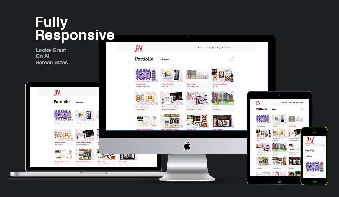
We create web designs that can automatically adapt to various screen sizes (from 320px to 1200px) thanks to its responsive capabilities.
We created not only responsive but also clean pixel-perfect design. This looks fantastic, not only on the desktop, but also on the mobile phones such as iPhones. Every element has been tweaked for different screen sizes to make sure it looks great no matter what the device. Now people can easily browse your site using smartphones, tablets, laptops or desktop computers.